Saludade
A yoga and meditation studio in Palma de Mallorca, Spain, the primary visual consistency of Saludade was found in a purchased Wordpress theme; I was brought in to give the venture a more current and unique identity and revitalize the web presence.
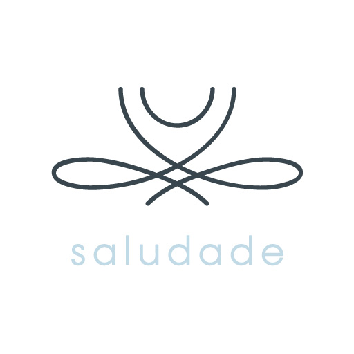
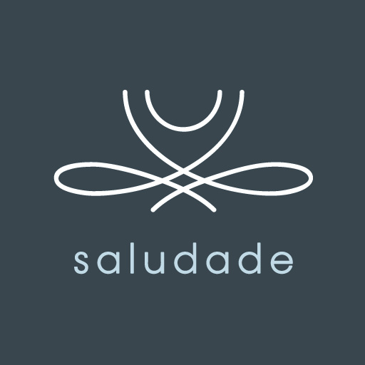
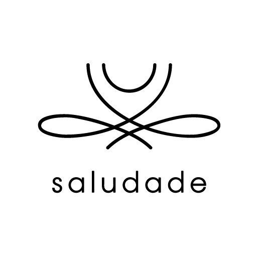

Top: Primary lockup
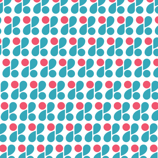
Bottom: Pattern illustration sample
Brief
The name comes from Salud—health in Spanish—and the name of Adelina, the proprietor. Keeping in mind the personal nature of both the business and the property on which sessions take place, the brand is meant to be as singular and personal as the name that it represents.
Yoga—and associated wellness practices—are a growing international market. The goal of the visuals was not to create a dynamic, complicated result with a million illustrations or specific intentions for tote bags, but rather a subtle and steady foundation for the studio. Based on a simple meditation pose, the logo is meant to evoke the calm and peace of mind that the practice brings.
Additionally, a floral pattern based on the glass doors at the property in Palma was drawn for supporting collateral such as business cards, t-shirts, price tags and thank-yous.
Looking Forward, Giving Back
First Exposures' slogan reads Empowering Youth Through Photography. The Bay Area nonprofit has been providing at-risk youth with one-on-one, photography-based mentoring programs for 25 years now. For the past decade they have hosted a yearly fundraiser featuring a silent auction of prints by students and mentors (as well as a variety of entertainment).


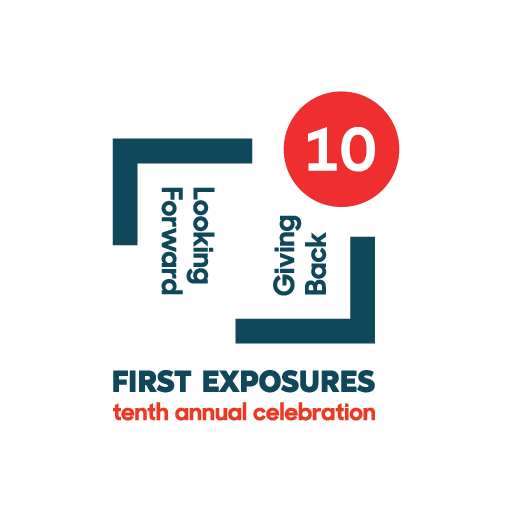

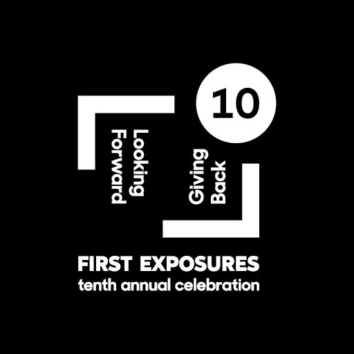
Top: Standard marks in color and black
Bottom: Special 10-year anniversary mark (2019)
Brief
The event branding required a number of targets to hit: appealing to all ages, representing the bold energy of the program and its students while also not forgetting the business side of a fundraising event. With the invitations and photographs changing each year, the logo must also fit comfortably within a variety of aesthetic frameworks.
I had designed the initial mark in 2012 to resemble the act of framing a composition. In 2018, First Exposures revised their brand-wide logo with a mark by AKQA, and all program-based collateral was to refine toward that visual direction.


Notes
Additional work on this series can be seen in the Promotional section. Above: work prepared for the 2020 event, delayed by Covid-19.
Torch
Bringing amateur sports to the world of social media, Torch is a far-reaching app that aims to be the cornerstone of any athlete's digital life. Combining team networking and match scheduling, the visual breadth of the application is far-reaching.
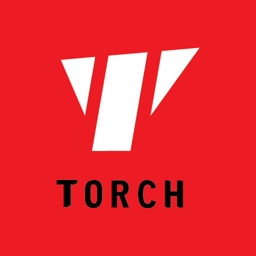
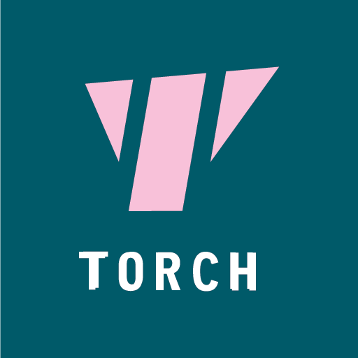

Top: Standard marks in color and black
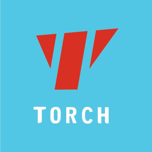
Bottom: Various potential team colors
Brief
Torch required an icon that would be competitive with the social media landscape while also being dynamic enough to host a variety of color combinations, as teams and players can customize their in-app experience. The app itself utilizes an array of icons and illustrations to expand a cohesive visual language.
Samples from icon set developed for in-app use
Notes
Additional work on this project can be seen in the UX/UI section.
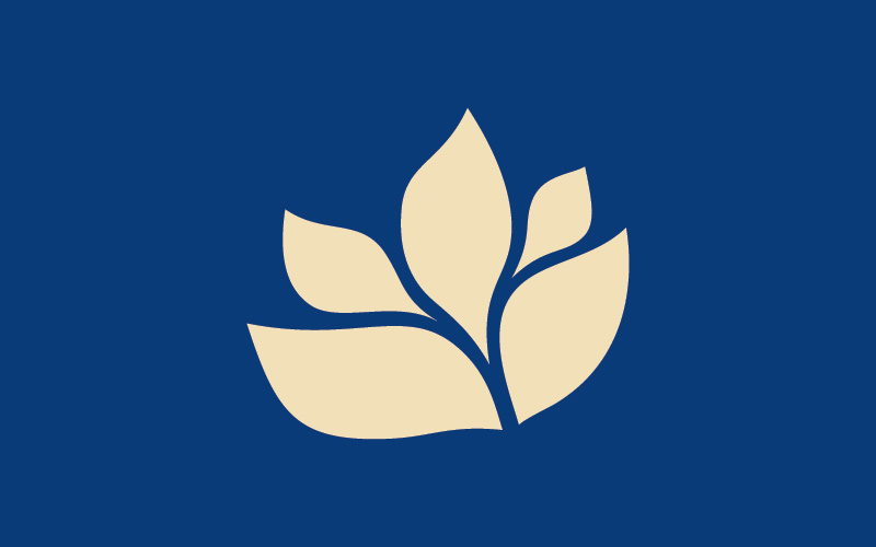
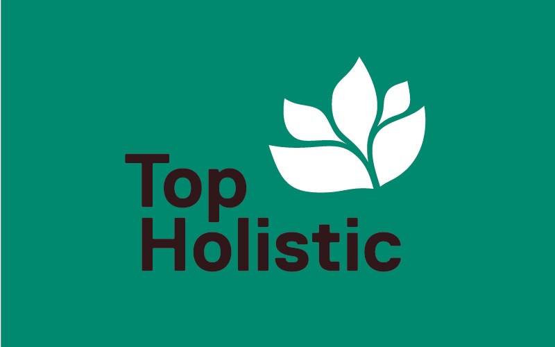
Top Holisitc
In working with the partners behind Top Doctors, Top Holistic seeks to align international practitioners of traditional, complementary and alternative medicines and natural remedies with patients seeking reliable information and consultation. With a growing interest in medical solutions outside of the standard pratice, but a lack of a source for where to go next, Top Holistic seeks to fill that void. As this market includes a range of practices—chiropractors, acupunturists, homeopathic remedies and massage are all under the same umbrella—the brand had to be both consistent but adaptive to variation.
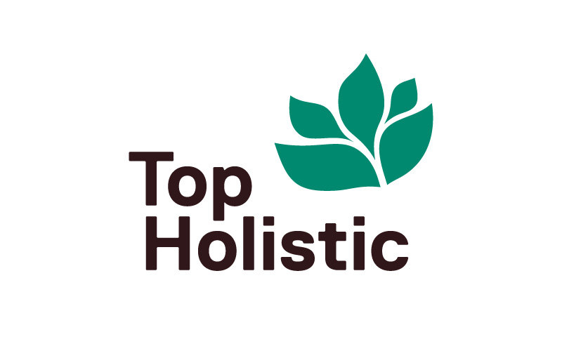
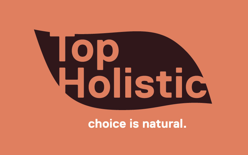
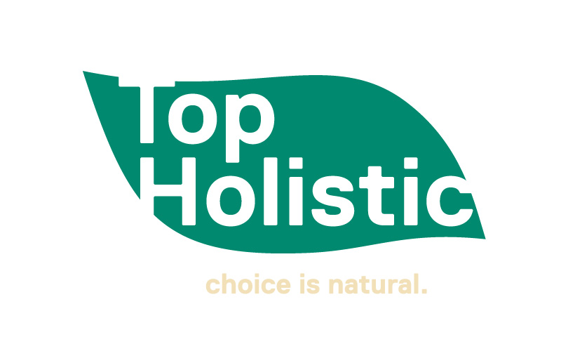
Top: Full logo and flower mark
Bottom: Various lockup alternates
Brief
To begin with the simple idea of showcasing the concept of nature would be essential as a building block for the rest of the brand. A nondescript plant was used as both the accent of the logo as well as an opportunity to create a knockout for the wordmark. The name was offset as a visual cue for the adjacent nature of the practice.
A mid-tone palette was developed to counter more traditional medical brands based in blue and feel more earthy in essence. Straightforward illustrations were drawn up to maintain a consistent visual look and re-inforce the idea of reliability and trustworthiness. A type study based in Replica was used for letterhead, business cards and various business- and consumer-facing collateral.
Example illustrations for application and promotional use
Jessica Clary
As a writer and editor, Jessica's use for personal branding is more of the pre-digital form: stationary, business cards, envelopes. Printed and paper-based needs of the classic design set.


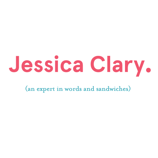
Top: Primary mark and alternate monogram
Bottom: Various alternate lockups